Mezair: A Natural Wine Concept
The idea for Mezair originally came to me as I was walking down Gaston Street early one morning. There’s one building in particular, on the corner of Gaston and Bull, that to this day remains one of my favorites in the city due to the work, or lack thereof, done on the exterior. As I looked around and noticed the beautifully restored and polished buildings, this one stood out to me for its rusted iron gates and patinaed walls. I found myself wanting a space that preserved the integrity of the building while also highlighting all of what makes these spaces unique as they age over time. As someone that regularly works with archived photography and “lo-fi” materials, I wanted to take on the challenge of seeing how this aesthetic could translate into a softer, intimate space.

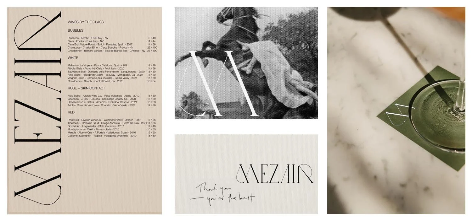
The name for this project, Mezair, comes from a technique within classical dressage where the horse makes short jumps forward while standing on it’s hind legs. I went with a timeless, lightweight serif font to represent that classical training, incorporating long arcs that mimic the movement of the horse’s leaps and jumps. It was also important to me that the logo be non-obtrusive and instead serve to highlight certain features of the space and the photography within it. I opted for a similarly timeless, classic scheme for the color palette. I sought out rich neutrals to convey the feeling of antiques or Baroque paintings. I also decided to go with a dark green to compliment the various shades of red wine that I picture in the space, with the warmer tones evoking memories of worn saddles and leather goods.